Review – Constantine: The Hellblazer #1
Like many fans of the original Vertigo series, I found John Constantine’s appearances in the New 52 to be… lacking. His books were still supernatural, but they weren’t horror, and he was frequently seen palling around with superhero-types. Someone at DC (possibly editor Andy Khouri) realized that magical superheroics are not the way to tell a John Constantine story, and now we have Constantine: The Hellblazer, the book we fans have been waiting for.
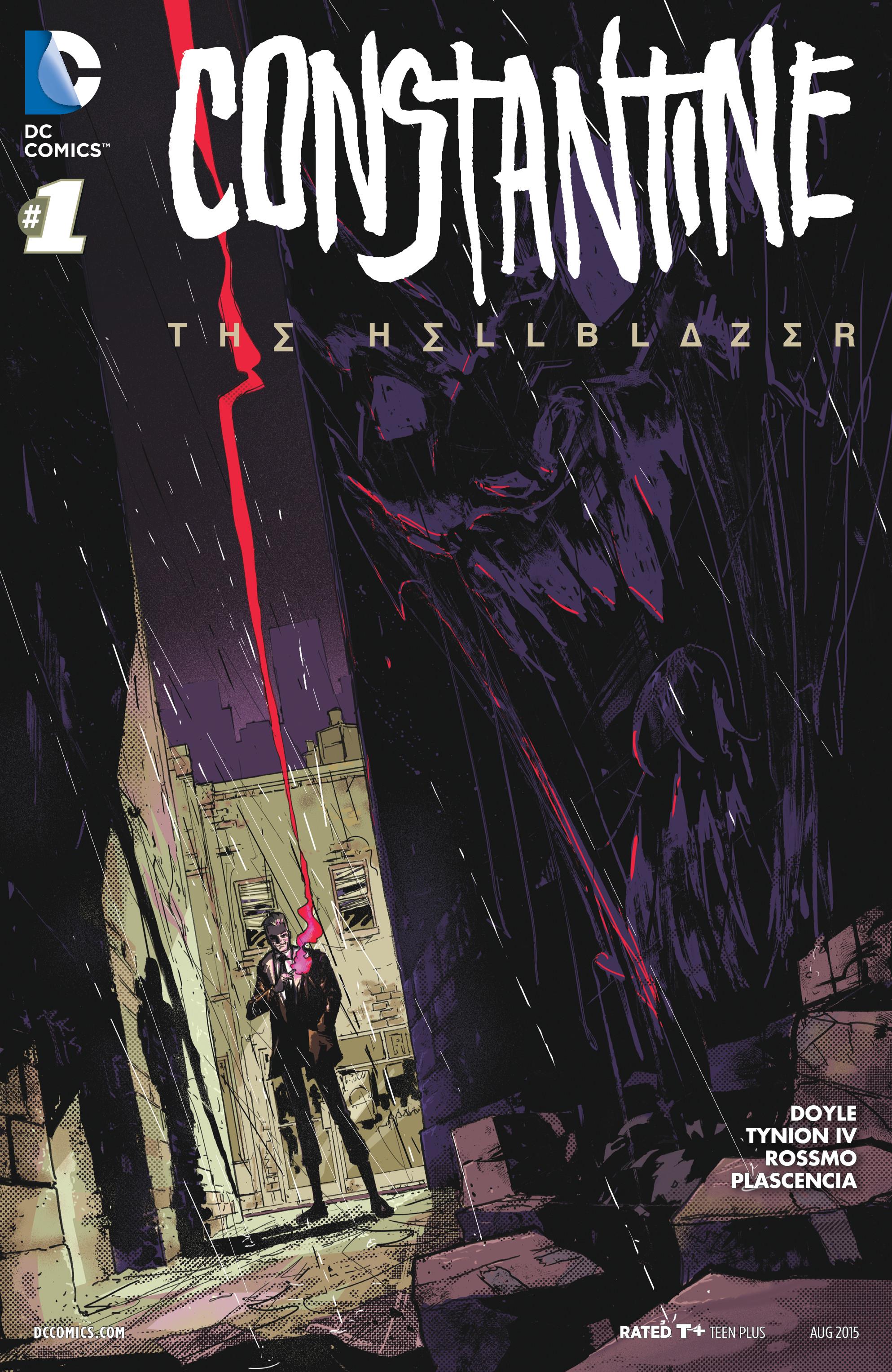
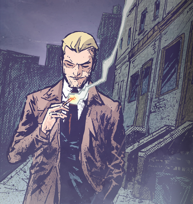
While I’m not a fan of the new logo, Riley Rossmo’s moody cover prepares you for a horror comic. Writers Ming Doyle and James Tynion IV want to do something new with the character, gaining inspiration from John’s early appearances in Swamp Thing. Some fans will likely mourn the loss of the signature trench coat, but there’s a lot that feels familiar too: the swagger, the cigarettes, the con artistry and manipulation – this is definitely John Constantine. He waltzes through a demon-run sex dungeon and steals a man’s wallet and cigarettes with the same confident ease. He’s literally haunted by his past mistakes. And his verbose voice-over feels in line with original writer Jamie Delano’s purple prose.
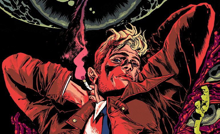
Unlike most of the Vertigo series, John’s sexuality is laid out clearly from the beginning. In this issue alone we hear of a woman he used to love, watch him flirt with a man in a pub, and then see him have sex with a demon. Between this, Doyle’s gorgeous variant cover, and Kevin Wada slated to do a variant for issue 3, DC is pushing Constantine as a bisexual (or pansexual) heartthrob. And I have absolutely no problem with that.
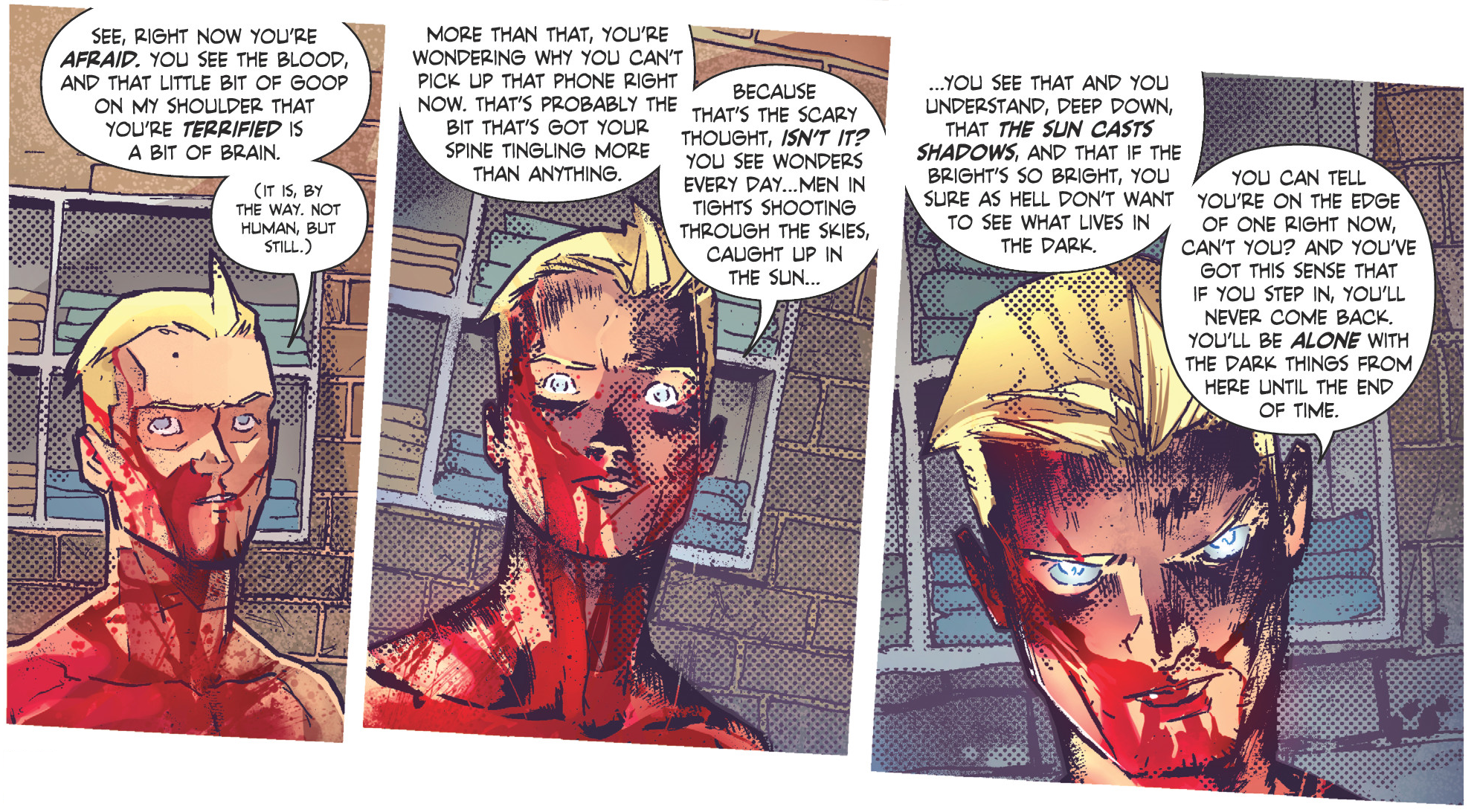
Also unlike the Vertigo series, this one is set in New York. John’s Britishisms have always been a distinct feature, and some of the dialogue here feels a bit forced, but it generally works much better than it did in the New 52. Thankfully Rossmo’s grimy NYC feels a lot like the original series’ London. Rossmo was a great choice for this book, and I love his aesthetic even if I wish his ladies were a bit more expressive. He excels at creative monster designs (Blythe in this issue is fabulous), and his page layouts enhance a gritty, spooky atmosphere. The mood is enhanced by Ivan Plascencia’s colour work, the muted palette in the real world offsetting a more vibrant, lively one for the supernatural beings. The lettering by Tom Napolitano follows Vertigo tradition by giving various demons their own fonts, and the variety of lettering design evokes a Sandman comic.
Now that NBC’s Constantine is officially done, many viewers are probably looking to fill a John-shaped hole in their hearts, and this is a good place to start. The T+ label might be a turn-off for some, but DC is upping the age recommendation to 15+, so we’re getting closer to the “Mature” rating we all want to see. If you’re not sure and want to get a taste of what’s to come, you can get a standalone preview story on Comixology for free! It’s not exactly the Hellblazer we know, and I’ll always miss that old bastard, but I’m excited to get to know this new one.
With great art and a take on its protagonist that's both fresh and familiar, Constantine: The Hellblazer is off to a great start for old and new fans alike.


